

R tip: How to create easy interactive scatter plots with taucharts
InfoWorld | May 14, 2018
In this first episode of Do More with R, Sharon Machlis, director of Editorial Data & Analytics at IDG Communications, demonstrates how easy it is to use the R language to create an interactive scatter plot with multiple trendline choices
Copyright © 2018 IDG Communications, Inc.
Similar
Hi, this is Sharon Machlis, Director of Editorial Data & Analytics at IDG Communications.
In this first episode of Do More with R, we’re going to look at how easy it is to create an interactive scatterplot with multiple trend line choices.
I'll be using the taucharts package. And, for data, the mtcars data set familiar to almost all R users. It has a few data points for some automobile models.
I'll tell you how to install taucharts in a bit, since it's not on CRAN yet. Including a cool package for installing from GitHub that you might not know about. But first, let me show you what taucharts does, so you'll *want* to install it.
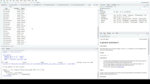
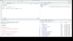
1) I'll load taucharts, mtcars, and dplyr. Why dplyr? Because I always end up wanting to use dplyr when I'm working in R.
library(taucharts)
data("mtcars")
library(dplyr)
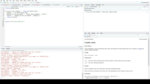
2) Next, I'll tweak mtcars to give it the format I want. I'll be creating a scatter plot showing miles per gallon by car weight, so I'll just keep the mpg and wt columns. I also want to add a column for the car model names. The default mtcars data frame has model names as row names, but not their own column. Here's the code for all that:
mtcars <- select(mtcars, wt, mpg) %>%
mutate(
model = row.names(mtcars)
)
You can see I’m selecting 2 columns from mtcars in the first line, then adding a model column with mutate.
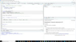
3) OK, ready to graph. This sets my data source:
tauchart(mtcars) %>%
Next line of code says I want a scatter plot, or graph with points, with weight on the x axis and mpg on my y axis:
tau_point("wt", "mpg") %>%
If you're familiar with ggplot2, note a difference here - you need the column names inside quotation marks with taucharts.
I want to add a tootip:
tau_tooltip() %>%
And I want to add trend line options
tau_trendline()
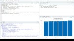
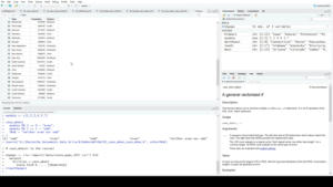
Run the code; then open results in a browser window, and voilà. Here’s an interactive scatterplot.
You can mouse over points to see underlying data. The tau_tooltip() command added all the columns in the graph's data set to the tooltip. That's why I wanted Models to be in a column.
tau_trendline() shows a linear regression line by default. But you can see there are several other options included.
That's how easy it is to create an interactive scatterplot with multiple trendline options in R!
As promised, here's information about installing taucharts. The package was written by security data scientist Bob Rudis. It's on his GitHub, at his hrbrmstr account. You can install it with the devtools package.
But another compelling option if you're lazy and don't want to have to type out the author’s GitHub account name is the githubinstall package. Install it with
install.packages("githubinstall")
and then run
githubinstall::githubinstall("taucharts")
It asks you if that's the one you want!
Type capital Y for yes and off you go.
That’s it for this episode, thanks for watching! For more R tips, follow me on Twitter at @sharon000. So long!
In this first episode of Do More with R, we’re going to look at how easy it is to create an interactive scatterplot with multiple trend line choices.
I'll be using the taucharts package. And, for data, the mtcars data set familiar to almost all R users. It has a few data points for some automobile models.
I'll tell you how to install taucharts in a bit, since it's not on CRAN yet. Including a cool package for installing from GitHub that you might not know about. But first, let me show you what taucharts does, so you'll *want* to install it.
1) I'll load taucharts, mtcars, and dplyr. Why dplyr? Because I always end up wanting to use dplyr when I'm working in R.
library(taucharts)
data("mtcars")
library(dplyr)
2) Next, I'll tweak mtcars to give it the format I want. I'll be creating a scatter plot showing miles per gallon by car weight, so I'll just keep the mpg and wt columns. I also want to add a column for the car model names. The default mtcars data frame has model names as row names, but not their own column. Here's the code for all that:
mtcars <- select(mtcars, wt, mpg) %>%
mutate(
model = row.names(mtcars)
)
You can see I’m selecting 2 columns from mtcars in the first line, then adding a model column with mutate.
3) OK, ready to graph. This sets my data source:
tauchart(mtcars) %>%
Next line of code says I want a scatter plot, or graph with points, with weight on the x axis and mpg on my y axis:
tau_point("wt", "mpg") %>%
If you're familiar with ggplot2, note a difference here - you need the column names inside quotation marks with taucharts.
I want to add a tootip:
tau_tooltip() %>%
And I want to add trend line options
tau_trendline()
Run the code; then open results in a browser window, and voilà. Here’s an interactive scatterplot.
You can mouse over points to see underlying data. The tau_tooltip() command added all the columns in the graph's data set to the tooltip. That's why I wanted Models to be in a column.
tau_trendline() shows a linear regression line by default. But you can see there are several other options included.
That's how easy it is to create an interactive scatterplot with multiple trendline options in R!
As promised, here's information about installing taucharts. The package was written by security data scientist Bob Rudis. It's on his GitHub, at his hrbrmstr account. You can install it with the devtools package.
But another compelling option if you're lazy and don't want to have to type out the author’s GitHub account name is the githubinstall package. Install it with
install.packages("githubinstall")
and then run
githubinstall::githubinstall("taucharts")
It asks you if that's the one you want!
Type capital Y for yes and off you go.
That’s it for this episode, thanks for watching! For more R tips, follow me on Twitter at @sharon000. So long!


Popular
Featured videos from IDG.tv