

R tip: Easy dashboards with flexdashboard
InfoWorld | Jun 8, 2018
In this fourth episode of Do More with R, Sharon Machlis, director of Editorial Data & Analytics at IDG Communications, shows how to create dashboards in the R language with the flexdashboard package.
Copyright © 2018 IDG Communications, Inc.
Similar
Hi, this is Sharon Machlis, Director of Editorial Data & Analytics at IDG Communications. I’m here with episode 4 of Do More With R: Build a quick dashboard.
I’m going to show one of the easiest ways to create a dashboard in R: Using the flexdashboard package.
First, you need to install it with install.packages
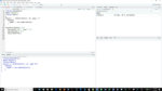
If you’re using RStudio, you can create a document with a flexdashboard template. Go to File > New File > R Markdown
And you’ll see an option to create a document From Template. If you’re not familiar with R Markdown, it’s a way to mix text, graphics, and R code, and create output like HTML or Word.
And there should be an option for a Flex Dashboard. I’ll make sure that’s selected, and click OK.
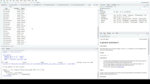
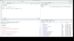
This is the default template. That top header between the three dashes is in a format called YAML, Y.A.M.L. It’s setting up the document output. This YAML says: Make this R Markdown document a flex dashboard, set it up by columns (you can also set it up by rows), and have it fill the entire available browser space.
This default template includes space for three charts. The first chart is in its own column, showing a width of 650. Then the next Column with the dashes below it creates a second column, with Charts B and C, at a width of 350. I’ll click the “knit” button to see what that looks like. The “knit” command turns an R Markdown document into its final output format, in this case HTML. I need to save the file before it will knit,
You can see the dashboard is set up for one wider column with one item, Chart A; and one narrower column with two items, Chart B and then Chart C below it. Now I need to create the graphics.
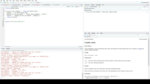
R code to create the charts and graphs goes inside these gray areas. You create those R code block sections with three backticks followed by a small letter r in braces to start, and three backticks to end.
I’m going to start adding R code to my dashboard by loading some libraries I know I’ll want. I’ll also import some data from last year’s Computerworld IT Salary Survey that I’ve got in a spreadsheet. You can use any R libraries you want, I’m going to use rcdimple for a bar chart and DT for a table. I’ll also give the dashboard a title.
See this little green triangle at the top right of the code chunk? That’s a “run this chunk” button. I can just run this code chunk
And the data is imported. I can take a look at that in RStudio by clicking the variable name.
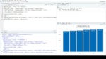
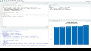
For Chart A, I’ll use rcdimple to make a basic bar chart, and also change the header to something besides “Chart A.”
You can see the dimple code is fairly simple. Let me knit this
There’s the bar chart. Because it’s a dimple JavaScript chart, I can hover over the bars and see the data.
Since this is a dashboard, it would be nice to have something graphical to highlight the latest salary number. And maybe show whether it’s up or down from the prior year. Flexdashboard’s valueBox function creates that kind of dashboard box.
The first line of code sets the arrow icon. If the first salary number if greater than the second one, I want to use font awesome’s up arrow. Otherwise, I’ll use the down arrow. I realize that means if the salary stays exactly the same it will still show a down arrow. I’m OK with that (after all, given inflation, if your salary stays the same, real purchasing power has gone down).
The second line of code sets the color: “success” if the salary has gone up, “danger” if the salary’s gone down. valueBox includes a few built-in color names like success, danger, warning, and info. You can also use color names.
The third line creates the value box. I used scales::dollar for the salary value so the number displays with a dollar sign and comma. I’ll knit that so you can see what we’ve got so far
The last part is adding a table with the salaries, which I’ll do with DT’s datatable function.
That options equals list in the datatable just removes the search box and pagination. There are only 6 rows in the table, so search and pagination would look kind of silly. I’ll take a final look at the dashboard:
And there’s a basic dashboard. There’s a LOT more you can do with these, customizing the look and make them more interactive. If you pair a flexdashboard with the R Shiny Web framework, you can even pull data in realtime. Here’s one by RStudio showing package downloads from their CRAN mirror
GOTO https://jjallaire.shinyapps.io/shiny-crandash/
RStudio has a lot more about flexdashboards at rmarkdown dot rstudio dot com slash flexdashboard. That’s all for this episode, thanks for watching! For more R tips, head to the More With R video page at bit.ly/morewithR. That’s https B I T period L Y slash more with R, all lowercase except for the R. So long!
I’m going to show one of the easiest ways to create a dashboard in R: Using the flexdashboard package.
First, you need to install it with install.packages
If you’re using RStudio, you can create a document with a flexdashboard template. Go to File > New File > R Markdown
And you’ll see an option to create a document From Template. If you’re not familiar with R Markdown, it’s a way to mix text, graphics, and R code, and create output like HTML or Word.
And there should be an option for a Flex Dashboard. I’ll make sure that’s selected, and click OK.
This is the default template. That top header between the three dashes is in a format called YAML, Y.A.M.L. It’s setting up the document output. This YAML says: Make this R Markdown document a flex dashboard, set it up by columns (you can also set it up by rows), and have it fill the entire available browser space.
This default template includes space for three charts. The first chart is in its own column, showing a width of 650. Then the next Column with the dashes below it creates a second column, with Charts B and C, at a width of 350. I’ll click the “knit” button to see what that looks like. The “knit” command turns an R Markdown document into its final output format, in this case HTML. I need to save the file before it will knit,
You can see the dashboard is set up for one wider column with one item, Chart A; and one narrower column with two items, Chart B and then Chart C below it. Now I need to create the graphics.
R code to create the charts and graphs goes inside these gray areas. You create those R code block sections with three backticks followed by a small letter r in braces to start, and three backticks to end.
I’m going to start adding R code to my dashboard by loading some libraries I know I’ll want. I’ll also import some data from last year’s Computerworld IT Salary Survey that I’ve got in a spreadsheet. You can use any R libraries you want, I’m going to use rcdimple for a bar chart and DT for a table. I’ll also give the dashboard a title.
See this little green triangle at the top right of the code chunk? That’s a “run this chunk” button. I can just run this code chunk
And the data is imported. I can take a look at that in RStudio by clicking the variable name.
For Chart A, I’ll use rcdimple to make a basic bar chart, and also change the header to something besides “Chart A.”
You can see the dimple code is fairly simple. Let me knit this
There’s the bar chart. Because it’s a dimple JavaScript chart, I can hover over the bars and see the data.
Since this is a dashboard, it would be nice to have something graphical to highlight the latest salary number. And maybe show whether it’s up or down from the prior year. Flexdashboard’s valueBox function creates that kind of dashboard box.
The first line of code sets the arrow icon. If the first salary number if greater than the second one, I want to use font awesome’s up arrow. Otherwise, I’ll use the down arrow. I realize that means if the salary stays exactly the same it will still show a down arrow. I’m OK with that (after all, given inflation, if your salary stays the same, real purchasing power has gone down).
The second line of code sets the color: “success” if the salary has gone up, “danger” if the salary’s gone down. valueBox includes a few built-in color names like success, danger, warning, and info. You can also use color names.
The third line creates the value box. I used scales::dollar for the salary value so the number displays with a dollar sign and comma. I’ll knit that so you can see what we’ve got so far
The last part is adding a table with the salaries, which I’ll do with DT’s datatable function.
That options equals list in the datatable just removes the search box and pagination. There are only 6 rows in the table, so search and pagination would look kind of silly. I’ll take a final look at the dashboard:
And there’s a basic dashboard. There’s a LOT more you can do with these, customizing the look and make them more interactive. If you pair a flexdashboard with the R Shiny Web framework, you can even pull data in realtime. Here’s one by RStudio showing package downloads from their CRAN mirror
GOTO https://jjallaire.shinyapps.io/shiny-crandash/
RStudio has a lot more about flexdashboards at rmarkdown dot rstudio dot com slash flexdashboard. That’s all for this episode, thanks for watching! For more R tips, head to the More With R video page at bit.ly/morewithR. That’s https B I T period L Y slash more with R, all lowercase except for the R. So long!


Popular
Featured videos from IDG.tv