

R tip: Animations in R
InfoWorld | Aug 24, 2018
In this eighth episode of Do More with R, learn how to animate data over time with R and the gganimate and ggplot2 packages.
Copyright © 2018 IDG Communications, Inc.
Similar
Hi, I’m Sharon Machlis, Director of Editorial Data & Analytics at IDG Communications. I’m here with Episode 8 of Do More With R: Animation.
Animation is one of the coolest things you can do with R. But besides being fun, animation can be a good way to look at data over time. Especially if you’ve got multiple data series you’re trying to show.
Housing prices are a great example. Len Kiefer, deputy chief economist at Freddie Mac, has done some cool work with this.
I definitely recommend his blog, at LenKiefer.com – l-e-n-k-i-e-f-e-r dot com – for a lot of interesting examples, like
Today I’d like to show you a slightly different way of animating housing prices – with lollipop charts. Let’s take a look.
First, the data.
I’ve got an index of housing prices for a few U.S. metro areas: Boston, Detroit, Philadelphia, San Francisco, and San Jose-Santa Clara, which I’m calling Silicon Valley. The way the index works is, January 1995 starts at 100. And then you can see how prices go up and down from there each quarter.
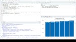
Let me first show you a static lollipop chart for a single quarter, the one starting January 1, 2000.
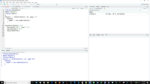
First I load some packages: ggplot2 and gganimate, which we need for the animation. And dplyr for data wrangling.
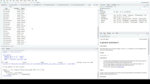
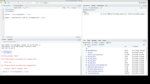
Next, I’ll import my housing data spreadsheet and take a look at the structure.
You can see it has 3 columns: Quarter and MetroArea, are character strings; and Index, which is a number.
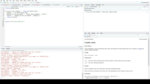
Next, I’ll create a subset of the data with just the January 1, 2000 quarter using dplyr’s filter function. The code below that creates a single static lollipop chart.
To give credit where credit is due here, I tweaked some code from r dash statistics dot c.o. for this chart.
The first couple of lines should look familiar if you use ggplot2. I’m setting the data source as housing data jan 2000, x as MetroArea, and Y as the Index. Then I’m going to both label and color based on Metro Area. Next line sets this visualization as a point chart.
Geom_segment turns this into a lollipop chart by adding lines from the X axis to each point
The next line adds text for the labels
And then the final two lines swap the X and Y axes and get rid of the legend.
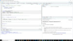
To animate the entire data set, we’ll need a few more lines of code.
This takes a little while to run, so let me source the file now while I explain the code.
We’ll be animating Quarter by Quarter, so we’ll be using the Quarter column to define each frame. Gganimate needs that column to be a date or number or a few other variable types, but character definitely won’t work. So first I change the Quarter column to be dates.
The new 3 lines at the bottom of the ggplot code are for gganimate. The first line, labs, sets the interactive title at the top of the visualization showing what frame the animation is on. The next line, transition_time, sets what column is used to show the time element. Finally, that ease_aes ‘linear’ says each frame should take the same amount of time.
Once this is done … nothing seems to have happened. The animation should be showing up in my RStudio viewer panel, but for some reason it’s not. But if I click to open it into my regular browser window, you’ll see the animation!
I find these can be kind of mesmerizing sometimes.
If you’d like to save the animation to a file, go back to R and use the anim_save function
That’s it for this episode, thanks for watching! For more R tips, head to the More With R video page at go.infoworld.com/morewithR. That’s https go period infoworld period com slash more with R, all lowercase except for the R. So long, and hope to see you next episode!
Animation is one of the coolest things you can do with R. But besides being fun, animation can be a good way to look at data over time. Especially if you’ve got multiple data series you’re trying to show.
Housing prices are a great example. Len Kiefer, deputy chief economist at Freddie Mac, has done some cool work with this.
I definitely recommend his blog, at LenKiefer.com – l-e-n-k-i-e-f-e-r dot com – for a lot of interesting examples, like
Today I’d like to show you a slightly different way of animating housing prices – with lollipop charts. Let’s take a look.
First, the data.
I’ve got an index of housing prices for a few U.S. metro areas: Boston, Detroit, Philadelphia, San Francisco, and San Jose-Santa Clara, which I’m calling Silicon Valley. The way the index works is, January 1995 starts at 100. And then you can see how prices go up and down from there each quarter.
Let me first show you a static lollipop chart for a single quarter, the one starting January 1, 2000.
First I load some packages: ggplot2 and gganimate, which we need for the animation. And dplyr for data wrangling.
Next, I’ll import my housing data spreadsheet and take a look at the structure.
You can see it has 3 columns: Quarter and MetroArea, are character strings; and Index, which is a number.
Next, I’ll create a subset of the data with just the January 1, 2000 quarter using dplyr’s filter function. The code below that creates a single static lollipop chart.
To give credit where credit is due here, I tweaked some code from r dash statistics dot c.o. for this chart.
The first couple of lines should look familiar if you use ggplot2. I’m setting the data source as housing data jan 2000, x as MetroArea, and Y as the Index. Then I’m going to both label and color based on Metro Area. Next line sets this visualization as a point chart.
Geom_segment turns this into a lollipop chart by adding lines from the X axis to each point
The next line adds text for the labels
And then the final two lines swap the X and Y axes and get rid of the legend.
To animate the entire data set, we’ll need a few more lines of code.
This takes a little while to run, so let me source the file now while I explain the code.
We’ll be animating Quarter by Quarter, so we’ll be using the Quarter column to define each frame. Gganimate needs that column to be a date or number or a few other variable types, but character definitely won’t work. So first I change the Quarter column to be dates.
The new 3 lines at the bottom of the ggplot code are for gganimate. The first line, labs, sets the interactive title at the top of the visualization showing what frame the animation is on. The next line, transition_time, sets what column is used to show the time element. Finally, that ease_aes ‘linear’ says each frame should take the same amount of time.
Once this is done … nothing seems to have happened. The animation should be showing up in my RStudio viewer panel, but for some reason it’s not. But if I click to open it into my regular browser window, you’ll see the animation!
I find these can be kind of mesmerizing sometimes.
If you’d like to save the animation to a file, go back to R and use the anim_save function
That’s it for this episode, thanks for watching! For more R tips, head to the More With R video page at go.infoworld.com/morewithR. That’s https go period infoworld period com slash more with R, all lowercase except for the R. So long, and hope to see you next episode!


Popular
Featured videos from IDG.tv