


Often, all you need in a table is data as text and numbers. But sometimes, you’d like to visualize results in each row, too. That’s especially true when each row of data is a trend over time.
You can do that inside a new table column with mini inline graphs called sparklines. You might be familiar with them in Excel, but you can create them in interactive HTML tables, too—with the sparkline package and four basic steps:
- Add a column in the data frame that has sparkline data and formatting.
- Add a snippet of JavaScript to the table options. That’s the same code all the time, so you can save it once and reuse it.
- This one is very easy: Add
escape = FALSEas adatatable()argument so HTML displays as HTML and not as the actual code. - This is also very easy: Pipe the results to a function that adds necessary dependencies so the table will display sparklines.
1. Add a column with sparkline data and formatting
Before adding sparklines to a table, you need a table. Here’s code to generate a table from a data frame called prices, including adding search filters and formatting one of the columns as percents:
library(DT)
datatable(prices, filter = ‘top’,
          options = list(paging = FALSE)) %>%
  formatPercentage(‘Change’, digits = 1)
If you’d like to follow along, code to create the prices data frame is at the bottom of this article. (You can also find more information about using the DT package at “Do More with R: Quick interactive HTML tables.”)
The format for adding a sparkline column is
sparkline_column = spk_chr(
  vector_of_values, type ="type_of_chart",
  chartRangeMin=0, chartRangeMax=max(.$vector_of_values)
)
The spk_chr() function has two required arguments: a vector of numeric values to visualize, and the type of graph you want. Visualization choices include line for a line chart, bar for a bar chart, box for a box plot, and a few more. Unfortunately, this isn’t actually documented in the sparkline package help files. But, you can see available types in the jQuery sparkline library documentation (the sparkline package is an HTML widget R wrapper for that library).
I like to use two optional arguments in my sparklines as well: setting the Y axis minimums and maximums.
So how do you get the vector of values for each row to use in the sparklines? You could write a for loop, but this is actually easier to do if the data is “tidy.” That is, containing only one observation per row, instead of the way it is now: multiple observations per row.
 Sharon Machlis/IDG
This table of price data shows that data is not ‘tidy’—it has multiple observations per row.
In the code below, I create a tidy version of the price data using the tidyr package and its gather() function.
library(tidyr)
tidyprices <- prices %>%
  select(-Change) %>%
  gather(key ="Quarter", value ="Price", Q1_1996:Q1_2018)
This code first loads the tidy package and removes the Change column with select(-Change), because I don’t want the percent change number to be in the trends I’m graphing. In gather(), I name the new category column Quarter, the new value column Price, and “gather” every column between Q1 1996 and Q1 2018.
If you run head(tidyprice), you’ll see that there’s now one observation for each row: MetroArea, Quarter, and Price.
head(tidyprices)
  MetroArea Quarter  Price
1    Boston Q1_1996 106.44
2   Detroit Q1_1996 107.99
3      Phil Q1_1996 105.25
4   SanFran Q1_1996 100.72
5  SiValley Q1_1996 102.93
6    Boston Q1_1998 116.78
Finally, I’m ready to create a data frame with sparkline info.
prices_sparkline_data <- tidyprices %>%
  group_by(MetroArea) %>%
  summarize(
    TrendSparkline = spk_chr(
      Price, type ="line",
      chartRangeMin = 100, chartRangeMax = max(Price)
    )
  )
After grouping by MetroArea, the above code creates a TrendSparkline column with the spk_chr() function. The first argument is the vector of values for each group—and that’s created automatically from the tidy data’s Price column, because I grouped by MetroArea and am now summarizing. I set the graph type to be a line chart. In this case, I want the Y axis’s minimum value to be 100, because that’s where the price index started for al cities in 1995. Finally, I set the Y axis’s maximum to be whatever the Price data’s maximum value is.
Here’s what my new dataframe looks like:
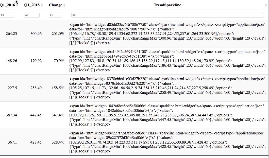
  MetroArea TrendSparkline
  <chr>     <chr>
1 Boston    "<span id=\"htmlwidget-d05dd23ac6f670067750\" class=\"sparkline html-widget\"></span>\n<script type=\"application/js...
2 Detroit   "<span id=\"htmlwidget-eba14942c5694b951f08\" class=\"sparkline html-widget\"></span>\n<script type=\"application/js...
3 Phil      "<span id=\"htmlwidget-8378cbbbf1c03d27b220\" class=\"sparkline html-widget\"></span>\n<script type=\"application/js...
4 SanFran   "<span id=\"htmlwidget-1842afdcc8bd5af0066e\" class=\"sparkline html-widget\"></span>\n<script type=\"application/js...
5 SiValley  "<span id=\"htmlwidget-09c227f72d3fbe9cd0d6\" class=\"sparkline html-widget\"></span>\n<script type=\"application/js...
You can see the TrendSparkline column contains a lot of HTML.
Next, I can add this data to the original prices data frame by using a dplyr left_join:
prices <- left_join(prices, prices_sparkline_data)
The hard part is done.
2. Add a JavaScript snippet
datatable(prices, filter = 'top',
          options = list(paging = FALSE, fnDrawCallback = htmlwidgets::JS(
  '
function(){
  HTMLWidgets.staticRender();
}
'
)
       )) %>%
  formatPercentage('Change', digits = 1)
That code starting from fnDrawCallback to the second single quote mark and single closing parentheses is what you need to add to the options list argument of the datatable code:
fnDrawCallback = htmlwidgets::JS(
  '
function(){
  HTMLWidgets.staticRender();
}
'
)
If you take a look at the table’s sparkline column now, you’ll see that the HTML code is appearing as the code itself, and not the code executing.
 Sharon Machlis/IDG
Sparkline code displaying as HTML code, instead of executing as HTML
You can fix that with Step 3.
3. Add escape = FALSE
Adding escape = FALSE to the datatable() code lets the code execute instead of display. (The default is escape = TRUE, which means the HTML code is escaped instead of executing.)
datatable(prices, escape = FALSE, filter = 'top', options = list(paging = FALSE, fnDrawCallback = htmlwidgets::JS(
  '
function(){
  HTMLWidgets.staticRender();
}
'
)
)) %>%
  formatPercentage('Change', digits = 1)
If you run the table with escaped code and take a look in RStudio, though, you likely won’t see anything in the sparklines column. That’s because you need one final step.
4. Add necessary dependencies
The final step is piping the results of the table into a function that adds all necessary dependencies for the sparklines to display: spk_add_deps() .
Here’s the final code:
datatable(prices, escape = FALSE, filter = 'top', options = list(paging = FALSE, fnDrawCallback = htmlwidgets::JS(
  '
function(){
  HTMLWidgets.staticRender();
}
'
)
)) %>%
  spk_add_deps()   %>%
  formatPercentage('Change', digits = 1)
You should see the sparklines.
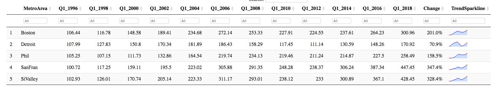 Sharon Machlis/IDG
HTML tables with sparklines created in R
You can also mouse over the graph to see the actual data points.
The code to create prices data frame
prices <- data.frame(stringsAsFactors=FALSE,
   MetroArea = c("Boston", "Detroit", "Phil", "SanFran", "SiValley"),
     Q1_1996 = c(106.44, 107.99, 105.25, 100.72, 102.93),
     Q1_1998 = c(116.78, 127.83, 107.15, 117.25, 126.01),
     Q1_2000 = c(148.58, 150.8, 111.73, 159.11, 170.74),
     Q1_2002 = c(189.41, 170.34, 132.86, 195.5, 205.14),
     Q1_2004 = c(234.68, 181.89, 164.54, 223.02, 223.33),
     Q1_2006 = c(272.14, 186.43, 219.74, 305.88, 311.17),
     Q1_2008 = c(253.33, 158.29, 234.13, 291.35, 293.01),
     Q1_2010 = c(227.91, 117.45, 219.46, 248.28, 238.12),
     Q1_2012 = c(224.55, 111.14, 211.24, 238.37, 233),
     Q1_2014 = c(237.61, 130.59, 214.87, 306.24, 300.89),
     Q1_2016 = c(264.23, 148.26, 227.5, 387.34, 367.1),
     Q1_2018 = c(300.96, 170.92, 258.49, 447.45, 428.45),
      Change = c(2.01, 0.709, 1.585, 3.474, 3.284)
)